Welcome to this comprehensive Lightning Web Components tutorial. In this guide, we’ll explore the fundamentals of Lightning Web Components (LWCs), understand why they are essential for modern Salesforce development, and walk through creating your first LWC step by step. By the end of this tutorial, you’ll have a solid foundation to start building powerful and efficient applications using Lightning Web Components.
Table of Contents
- What are Lightning Web Components?
- Why Use Lightning Web Components?
- Prerequisites
- Setting Up Your Development Environment
- Creating Your First Lightning Web Component
- Understanding LWC Files
- Styling Your Component
- Component Communication
- Debugging and Testing
- Deploying to Salesforce
- Conclusion
1. What are Lightning Web Components?
Lightning Web Components (LWC) are a modern JavaScript framework developed by Salesforce for building responsive, efficient, and robust web applications on the Salesforce platform. LWCs leverage core web components standards, allowing developers to use native browser APIs and custom elements without heavy abstractions or complex frameworks.
Key Features
- Standards-Based: Built on modern web standards like ES6+, Shadow DOM, Custom Elements, and Templates.
- Performance: Native browser support reduces the need for abstractions, leading to faster load times and better runtime performance.
- Component-Based Architecture: Encourages reusability and modularity, making applications easier to maintain and scale.
- Compatibility: LWCs can coexist with Aura components, allowing for gradual migration and integration.
2. Why Use Lightning Web Components?
Choosing Lightning Web Components offers several advantages for developers and organizations alike:
Modern Development Practices
- Latest JavaScript Features: Utilize ES6 modules, classes, promises, and more.
- Standardized Skills: Skills learned are transferable to other web development projects outside Salesforce.
Improved Performance
- Reduced Overhead: Less abstraction means lighter components and faster execution.
- Optimized Rendering: Efficient rendering cycles lead to smoother user experiences.
Enhanced Developer Experience
- Intuitive Syntax: Easier to learn and use compared to previous frameworks.
- Better Tooling: Support for modern development tools, including rich IDEs and code editors.
Seamless Integration
- Interoperability: Works alongside existing Aura components and Visualforce pages.
- API Compatibility: Easily interact with Salesforce data and services using Apex and Lightning Data Service.
3. Prerequisites
Before diving into Lightning Web Components, ensure you have the following prerequisites:
Salesforce Account
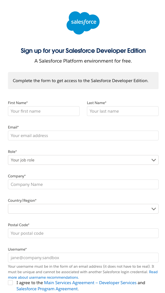
- Salesforce Developer Edition Org: If you don’t have one, sign up for a free account here.
You need to enter all the required detail to complete your Salesforce Developer edition sign up.

Development Tools
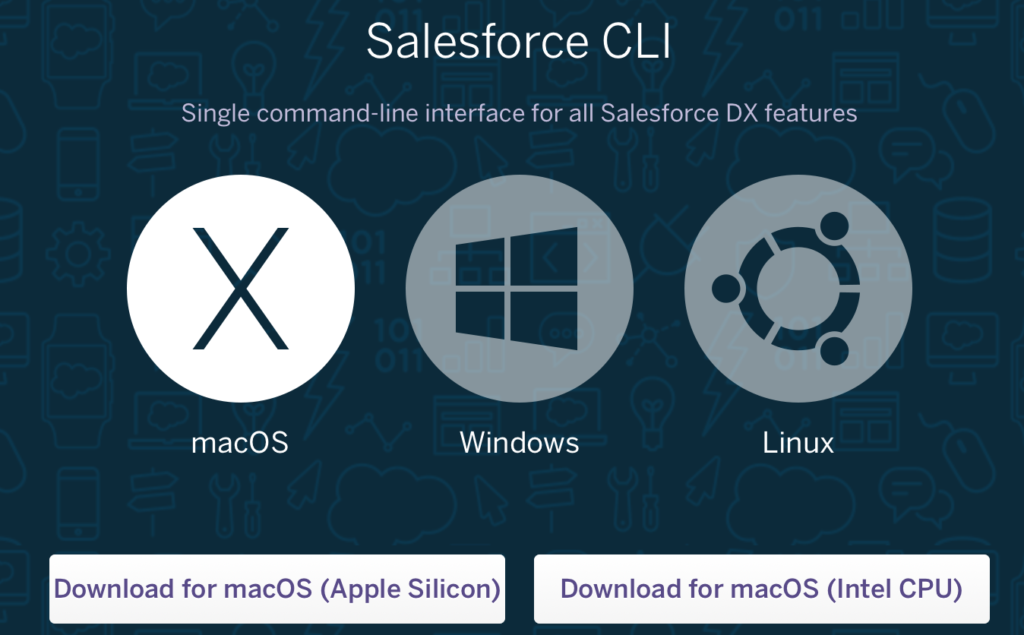
- Salesforce CLI (Command-Line Interface):
- Download and install from the official site.

- Verify installation by running
sfdx --versionin your terminal or command prompt. - Visual Studio Code (VS Code):
- Download from here.
- Install the Salesforce Extension Pack from the VS Code marketplace.
Basic Knowledge
- JavaScript ES6+: Familiarity with modern JavaScript syntax and features.
- HTML & CSS: Understanding of web markup and styling.
We will learn about ECMAScript features for LWC and HTML & CSS in our upcoming Salesforce tutorial in detail.
4. Setting Up Your Development Environment
Setting up your environment is crucial for developing Lightning Web Components efficiently.
Install Salesforce CLI
- Download Installer:
- Choose the appropriate installer for your operating system (Windows, macOS, Linux).
- Run Installer:
- Follow the on-screen instructions to complete the installation.
- Verify Installation:
- Open your terminal or command prompt.
- Run the command:
bash sfdx --version - You should see the installed version of Salesforce CLI.
Set Up Visual Studio Code
- Install VS Code:
- Download and install VS Code from the official website.
- Install Salesforce Extension Pack:
- Open VS Code.
- Navigate to the Extensions view by clicking on the Extensions icon or pressing
Ctrl+Shift+X(Windows/Linux) orCmd+Shift+X(macOS). - Search for Salesforce Extension Pack.
- Click Install.
- Configure Workspace:
- Create a new folder for your Salesforce projects.
- Open this folder in VS Code (
File>Open Folder).
5. Creating Your First Lightning Web Component
Let’s build a simple Lightning Web Component step by step.
Step 1: Create a New Salesforce DX Project
- Open Command Palette:
- In VS Code, press
Ctrl+Shift+P(Windows/Linux) orCmd+Shift+P(macOS).
- Create Project:
- Type
SFDX: Create Projectand select it. - Choose Standard as the project type.
- Enter a project name, e.g.,
LWC_Tutorial. - Select the folder you created earlier to store the project.
Step 2: Authorize a Salesforce Org
- Authorize Org:
- In the command palette, type
SFDX: Authorize an Org. - Choose Project Default for the login URL.
- Provide an alias for your org (optional), e.g.,
LWC_DevOrg.
- Login to Salesforce:
- A browser window will open prompting you to log in.
- Enter your Salesforce Developer Edition credentials.
- After successful login, you can close the browser window.
Step 3: Create a Lightning Web Component
- Generate Component:
- In the command palette, type
SFDX: Create Lightning Web Component. - Enter a name for your component, e.g.,
helloWorld.- Component names must be all lowercase with no spaces.
- Select Directory:
- Choose the default directory:
force-app/main/default/lwc.
- Verify Component Creation:
- In the Explorer view, navigate to
force-app/main/default/lwc/helloWorld. - You should see three files:
helloWorld.htmlhelloWorld.jshelloWorld.js-meta.xml
6. Understanding LWC Files
Each Lightning Web Component consists of several files that serve different purposes.
Component Structure
- HTML Template (
.html): Defines the component’s UI. - JavaScript Controller (
.js): Contains the component’s logic. - Metadata Configuration (
.js-meta.xml): Specifies metadata values like API version and component visibility. - Optional CSS File (
.css): Styles the component’s template.
File Breakdown
helloWorld.html
This file defines the structure and content of your component’s user interface.
<template>
  <h1>Hello, Lightning Web Components!</h1>
</template>
helloWorld.js
This file contains the JavaScript logic for your component.
import { LightningElement } from 'lwc';

export default class HelloWorld extends LightningElement {
  // Component logic goes here
}
helloWorld.js-meta.xml
This XML file defines the metadata configuration for your component.
<?xml version="1.0" encoding="UTF-8"?>
<LightningComponentBundle xmlns="http://soap.sforce.com/2006/04/metadata">
  <apiVersion>58.0</apiVersion>
  <isExposed>true</isExposed>
  <targets>
    <target>lightning__AppPage</target>
    <target>lightning__RecordPage</target>
    <target>lightning__HomePage</target>
  </targets>
</LightningComponentBundle>- apiVersion: Specifies the Salesforce API version.
- isExposed: Determines if the component is available in Lightning App Builder.
- targets: Defines where the component can be used.
7. Styling Your Component
To enhance the visual appeal of your Lightning Web Components, you can add custom styles.
Step 1: Create a CSS File
- In the
helloWorldfolder, create a new file namedhelloWorld.css.
Step 2: Add Styles
h1 {
  color: #1e90ff;
  text-align: center;
  font-family: Arial, sans-serif;
}
Step 3: Save and Preview
- The styles defined in
helloWorld.cssare scoped to your component. - There’s no need to import the CSS file; it’s automatically applied.
Note on Styling
- Scoped CSS: Styles apply only to elements within the component.
- SLDS (Salesforce Lightning Design System): You can use SLDS classes for consistent styling across Salesforce.
Example using SLDS:
<template>
  <h1 class="slds-text-heading_large slds-text-color_success">
    Hello, Lightning Web Components!
  </h1>
</template>
8. Component Communication
Understanding how components communicate is crucial in building complex applications with Lightning Web Components.
Parent to Child Communication
Pass data from a parent component to a child component using public properties.
Child Component (childComponent)
childComponent.js
import { LightningElement, api } from 'lwc';

export default class ChildComponent extends LightningElement {
  @api message;
}
childComponent.html
<template>
  <p>{message}</p>
</template>
Parent Component (parentComponent)
parentComponent.html
<template>
  <c-child-component message="Hello from Parent Component"></c-child-component>
</template>
Child to Parent Communication
Communicate from a child component to a parent component using custom events.
Child Component (childComponent)
childComponent.js
import { LightningElement } from 'lwc';

export default class ChildComponent extends LightningElement {
  handleClick() {
    const event = new CustomEvent('buttonclick', {
      detail: { data: 'Data from Child' }
    });
    this.dispatchEvent(event);
  }
}
childComponent.html
<template>
  <button onclick={handleClick}>Click Me</button>
</template>
Parent Component (parentComponent)
parentComponent.js
import { LightningElement } from 'lwc';

export default class ParentComponent extends LightningElement {
  handleButtonClick(event) {
    const receivedData = event.detail.data;
    console.log('Received data: ', receivedData);
  }
}
parentComponent.html
<template>
  <c-child-component onbuttonclick={handleButtonClick}></c-child-component>
</template>
Sibling Communication
For components that are not in a direct parent-child relationship, use Lightning Message Service (LMS) or a pub-sub model.
9. Debugging and Testing
Ensuring your Lightning Web Components work as intended requires effective debugging and testing strategies.
Debugging Techniques
Console Logging
- Use
console.log()statements to output variable values and application states. - Example:
console.log('Current value:', this.value);Browser Developer Tools
- Inspect elements, monitor network requests, and view console logs.
- Access developer tools by pressing
F12or right-clicking and selecting Inspect.
Debug Mode
- Enable Debug Mode in Salesforce:
- Navigate to Setup > Debug Mode.
- Enable it for your user to get unminified JavaScript code.
Testing Your Components
Unit Testing with Jest
- Jest is a JavaScript testing framework supported by Salesforce for LWCs.
- Install dependencies:
npm install- Create test files in the
__tests__directory. - Example test (
helloWorld.test.js):
  import { createElement } from 'lwc';
  import HelloWorld from 'c/helloWorld';

  describe('c-hello-world', () => {
    afterEach(() => {
      while (document.body.firstChild) {
        document.body.removeChild(document.body.firstChild);
      }
    });

    it('renders greeting', () => {
      const element = createElement('c-hello-world', {
        is: HelloWorld
      });
      document.body.appendChild(element);
      const h1 = element.shadowRoot.querySelector('h1');
      expect(h1.textContent).toBe('Hello, Lightning Web Components!');
    });
});- Run tests using:
npm run test:unitLWC Test Tools
- LWC Jest: Provided by Salesforce, integrates seamlessly with your LWC project.
- VS Code Extensions: Use extensions like Jest for VS Code to run and debug tests within the editor.
10. Deploying to Salesforce
After developing and testing your Lightning Web Components, it’s time to deploy them to your Salesforce org.
Step 1: Save All Changes
- Ensure all your files are saved in VS Code (
File>Save AllorCtrl+K S).
Step 2: Deploy Source to Org
- Deploy Entire Project:
- In the command palette, type
SFDX: Deploy Source to Org. - Select the
force-appfolder if prompted. - Deploy Specific Components:
- Right-click on the component folder (e.g.,
helloWorld) and select SFDX: Deploy Source to Org.
Step 3: Verify Deployment
- In the VS Code terminal or output panel, check for a success message.
- Alternatively, log in to your Salesforce org and navigate to Setup > Lightning Components to see your component listed.
Step 4: Add Component to Lightning App Builder
- Open Lightning App Builder:
- In Salesforce, navigate to Setup > User Interface > Lightning App Builder.
- Click New to create a new page or edit an existing one.
- Create a New Page:
- Choose a page type (e.g., App Page, Home Page, or Record Page).
- Select a template and click Finish.
- Add Your Component:
- In the Lightning App Builder, find your component under the Custom components section.
- Drag and drop
helloWorldonto the desired area of the page.
- Save and Activate:
- Click Save.
- Click Activation to make the page available to users.
- Set the page as the default or assign it to specific profiles.
- Preview the Page:
- Navigate to the page to see your Lightning Web Component in action.
11. Conclusion
Congratulations! You’ve successfully completed this Lightning Web Components tutorial. You’ve learned:
- What Lightning Web Components are and why they are essential.
- How to set up your development environment.
- The step-by-step process of creating, styling, and deploying a Lightning Web Component.
- How components communicate and how to debug and test them.
Next Steps
To further enhance your skills with Lightning Web Components, consider exploring:
- Data Binding and Apex Integration: Learn how to interact with Salesforce data using Apex controllers.
- Advanced Component Communication: Dive deeper into the Lightning Message Service and Pub-Sub patterns.
- Third-Party Integrations: Integrate external JavaScript libraries and APIs.
- Performance Optimization: Understand best practices for optimizing component performance.
Resources
- Salesforce Developer Documentation: Lightning Web Components Developer Guide
- Trailhead Modules: Complete interactive tutorials on Trailhead.
Share Your Experience
We encourage you to share your experiences, ask questions, or provide feedback as you continue your journey with Lightning Web Components. The Salesforce community is vibrant and supportive, and there are many resources available to help you succeed.