
FlexCards in Salesforce are a central part of Salesforce OmniStudio, enabling developers and admins to create engaging interfaces that display contextual information from various data sources. They provide the capability to build reusable UI components that can be used across different channels like Salesforce Lightning pages, Communities, and external websites. This guide offers an overview of what FlexCards in Salesforce are and explains how you can create one.
What are FlexCards in Salesforce?
FlexCards in Salesforce are configurable, reusable UI components designed for compact data display and user interaction. They are crafted declaratively using the low-code architecture in the FlexCard Designer, which is part of the OmniStudio suite. Data displayed on a FlexCard can come from Salesforce objects, Apex classes, Integration Procedures, or external systems via REST APIs. FlexCards are highly flexible and can be nested to build complex, scalable UIs.
Key Features of FlexCards
- Declarative Design with FlexCard Designer: Create FlexCards visually using drag-and-drop without the need to code.
- Modular and Reusable Components: Build modular components that can be reused across various parts of your application.
- Flexible Data Sources: Source data from multiple origins, including Salesforce objects, Integration Procedures, and REST APIs.
- Responsive Design: Create FlexCard layouts that work on all devices and screen sizes.
- Actionable Elements: Add actions like navigation, data updates, and launching OmniScripts directly from the FlexCard.
- Lightning Web Components (LWC) Generation: Activated FlexCards are converted to LWCs for optimal performance and integration with Salesforce.
Creating a OmniStudio FlexCards : Step-by-Step Tutorial
How to Create a FlexCard in Salesforce OmniStudio
Prerequisites
- Salesforce org with OmniStudio access
- Required permissions to create and deploy OmniStudio components
Step 1: Access the FlexCard Designer
- Log in to Salesforce: Log in to your Salesforce org.
- Open the App Launcher: Click the App Launcher (the grid icon) in the upper-left corner.
- Search for “FlexCards”: In the search bar, type “FlexCards” and select FlexCards under the OmniStudio section.
Step 2: Create a New FlexCard
- Click “New”: In the FlexCards interface, click New to create a new FlexCard.
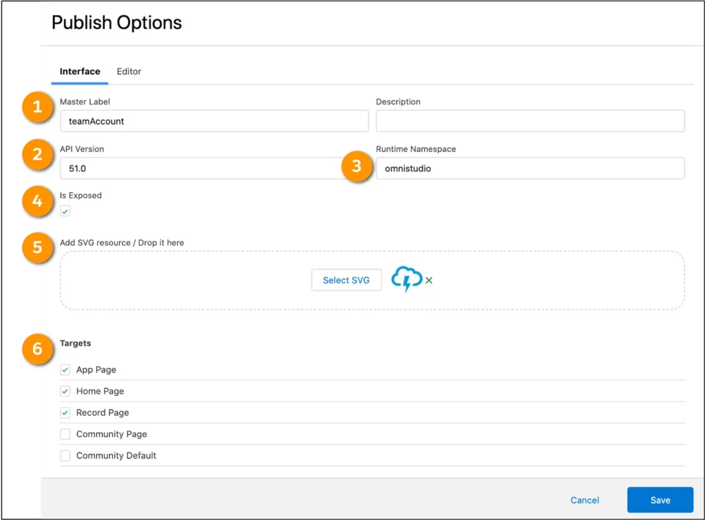
- Enter FlexCard Details:
- Name: Give your FlexCard a unique name (e.g., “Account Summary Card”).
- Author: Your name or ID (auto-populated).
- Description: (Optional) Enter a description for future reference.
- Is Child Card: Leave unchecked unless you are creating a child FlexCard.
- Click “Next” to proceed.
Step 3: Choose a Template (Optional)
- Select a Template: Choose from an array of ready-to-use templates or start with a blank canvas.
- Click “Next” after selecting the template.
Step 4: Define Data Sources
- Go to the “Data” Tab: Located at the top of the FlexCard Designer.
- Add a Data Source:
- Click “Add Data Source”: Select how you will consume your data.
- Select Data Source Type:
- SOQL Query: For Salesforce objects.
- DataRaptor Extract: Use an existing DataRaptor.
- Integration Procedure: For complex data gathering.
- REST API: For external data sources.
- Example: Select SOQL Query to query data from Salesforce.
- Configure the Data Source:
- Object: Select the Salesforce object (e.g.,
Account). - Fields: Select the fields to retrieve (e.g.,
Name,Industry,AnnualRevenue). - Conditions: (Optional) Apply filters to narrow down the data.
- Object: Select the Salesforce object (e.g.,
- Save the Data Source: Click Save to confirm.
Step 5: Design the FlexCard Layout
- Add Elements to the Canvas:
- Fields: Drag and drop the Field element onto the canvas.
- Configure Fields:
- Label: Enter a label (e.g., “Account Name”).
- Field Value: Bind to a data field using the
{data}syntax (e.g.,{Account.Name}).
- Repeat for Other Fields: Add additional fields like Industry and Annual Revenue.
- Use Containers and Rows:
- Containers: Organize elements by dragging a Container onto the canvas.
- Rows and Columns: Structure your layout using rows and columns within containers.
- Add Images or Icons:
- Image Element: Drag the Image element to display logos or icons.
- Configure Source: Provide a static URL or bind to a data field.
Step 6: Add Actions (Optional)
- Drag the “Action” Element: Place it where you want the action button to appear.
- Configure the Action:
- Label: Enter the button label (e.g., “View Details”).
- Action Type: Select the type of action (e.g., Navigate, Update Data).
- Parameters: Define any required parameters, such as target URLs or data to update.
Step 7: Set Styling and Behavior
- Styling:
- Select Elements: Click on an element to style.
- Properties Panel: Adjust properties like font size, color, and alignment.
- Conditional Rendering:
- Set Conditions: Define when an element should be visible based on data conditions.
- Example: Only show the “Annual Revenue” field if it exceeds a certain amount.
Step 8: Preview the FlexCard
- Click “Preview”: At the top-right corner to see how the FlexCard looks with sample data.
- Input Test Data: You can input test data or use actual records for previewing.
- Make Adjustments: Return to the designer to make any necessary changes based on the preview.
Step 9: Activate the FlexCard
- Click “Activate”: Once you’re satisfied with the design, activate the FlexCard.
- Versioning: Provide version details if prompted.
- Confirm Activation: The FlexCard will now be compiled into a Lightning Web Component.
Step 10: Deploy the FlexCard
- Add to a Lightning Page:
- Navigate to Lightning App Builder: Go to a Lightning page where you want to add the FlexCard.
- Edit the Page: Click on Edit Page.
- Add Component: In the components panel, find your FlexCard under Custom Managed components.
- Drag to Canvas: Place the FlexCard component onto the page layout.
- Save and Activate: Save your changes and activate the page if necessary.
- Deploy to Communities or External Sites:
- Experience Builder: Add the FlexCard to a Community page using the Experience Builder.
- External Deployment: Use OmniOut to deploy the FlexCard outside of Salesforce if needed.
Usage Scenarios
- Customer Portals: Display account summaries, recent transactions, or support case statuses to customers.
- Agent Consoles: Provide customer service agents with quick access to customer information and interaction history.
- Sales Dashboards: Present key performance indicators (KPIs) and sales metrics to sales representatives.
- Field Service: Show work orders, equipment details, or service history to field technicians.
Best Practices
- Reuse FlexCards: Design FlexCards to be reusable across multiple pages or applications.
- Optimize Data Sources: Use Integration Procedures or DataRaptors for complex data retrieval to improve performance.
- Responsive Design: Test FlexCards on different devices to ensure they display correctly.
- Version Control: Keep track of FlexCard versions for maintenance and updates.
Conclusion
In Salesforce OmniStudio, FlexCards are a powerful feature that allows you to create dynamic and informative user interfaces with drag-and-drop functionality. This step-by-step tutorial has shown you how to build and deploy FlexCards that enhance user experience while providing easy access to vital information. As you become comfortable with FlexCards, explore more advanced topics like nesting, state management, and integration with other OmniStudio components to create even more powerful solutions.
By leveraging FlexCards, organizations can deliver agile and personalized experiences to their users, meeting specific use cases without complex development efforts.
Note: Be sure to check the latest Salesforce documentation and release notes for OmniStudio and FlexCards for the most recent feature updates, tips, and techniques.